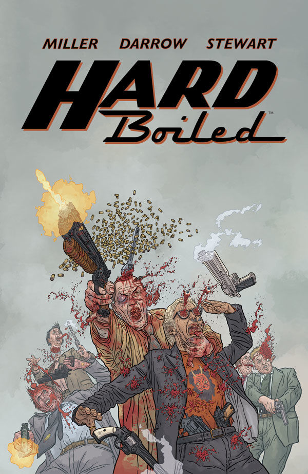
PopCultHQ received an advance review copy of the Second Edition of HARD BOILED from Dark Horse Comics. Available on March 22nd at comic book shops & April 11th in bookstores, the creative team for this trade paperback features writing from Frank Miller, illustrations from Geof Darrow, colors from Dave Stewart., and letters by John Workman.
Here’s PopCultHQ’s spoiler-free review of…
HARD BOILED TPB (Second Edition)
Written by Frank Miller
Art by Geof Darrow
Colors by Dave Stewart
Letters by John Workman
Genre: Science-Fiction, Crime, Action/Adventure
Format: FC, 136 pages; TPB, 7″ x 10″
Publisher: Dark Horse Comics
ISBN-13: 978-1-50673-109-4
ISBN-10: 1-50673-109-0
Age range: 16+
SRP: $19.99
Comic shop release date: 3/22/23
Bookstore release date: 4/11/23
Eisner Award Winner!.
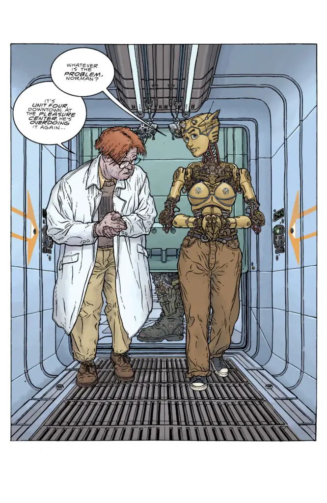
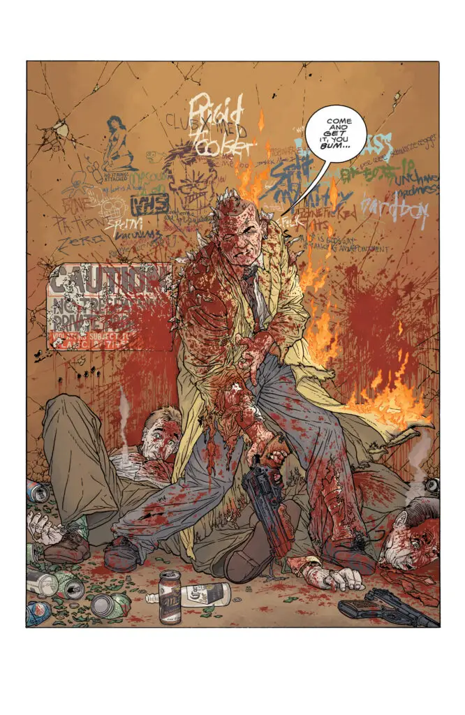
Carl Seltz is a suburban insurance investigator, a loving husband, and a devoted father. Nixon is a berserk, homicidal tax collector racking up mind-boggling body counts in a diseased urban slaughterhouse. Unit Four is the ultimate robot killing machine–and the last hope of the future’s enslaved mechanical servants. And they’re all the same psychotic entity.
PopCultHQ’s Comic Book Review:
HARD BOILED TPB
(Second Edition)
Another 90’s production from the collaborative minds of Frank Miller and Geof Darrow, this intense and over-the-top sci-fi feature will be for some a welcome sight. Others may feel differently. And there are also those who will scratch their heads and go “what the heck”? One of the big takeaways from this comic is that while the whole series is very strange, it is still engaging enough to keep readers invested in seeing the outcome.
Writing: Over the years, Frank Miller has crafted a lot of truly amazing comics: Sin City, The Dark Knight Returns, his long run on Daredevil for Marvel. All of them are examples of the type of storytelling that became associated with groundbreaking achievements in the industry thanks to Frank. Here… the writing is certainly riveting, but the plot as a whole makes no sense. Whatever Frank and Geof were smoking when they laid out the scripts for this three-issue romp of ultra-violence and bizarre plot twists, they clearly needed to back off from it.
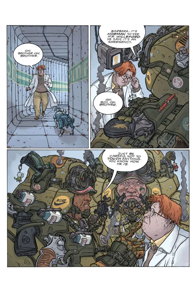
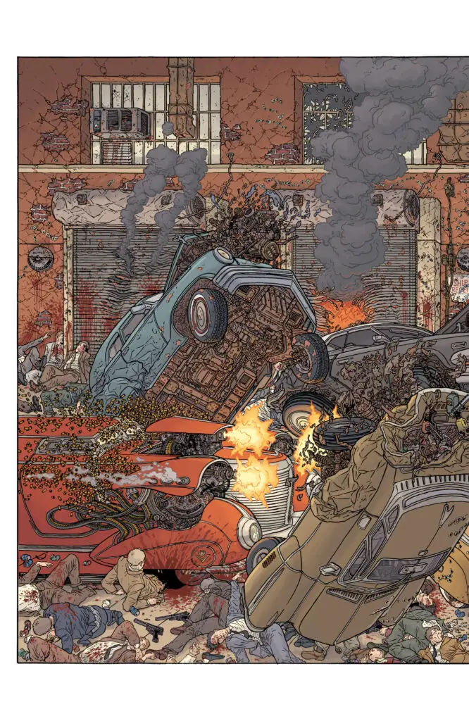
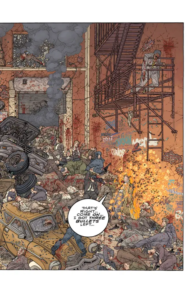
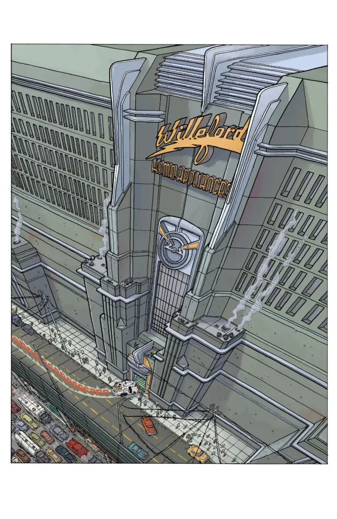
Art: Geof, on the other hand, went to town again with the artwork. This time, instead of the sleek and spiffy throwback to the Golden Age of Sci-Fi linework that this reviewer saw in Big Guy and Rusty, I was treated to clean lines that were crumpled as quickly as the insane amount of cars and property damage perpetuated throughout the book. Also, there are moments where Geof throws in little things like a surgery pod that contains medical tools, fetuses, and candy bars. Totally bonkers and yet, within the context of this insane comic, it is fitting. Once again, top marks to Geof for nailing it.
Colors: Dave Stewart is very gifted in his field of work. However, this is one time where careful research revealed he is NOT the colorist that was originally associated with this series. That honor goes to Claude Legris. In the original series, Claude’s colors are really terrific and mesh well with the insane artwork (both graphic and non-graphic layouts) that Geof illustrated. Dave’s choices colorwise for this re-release of the series are a stark contrast, in ways both big and small. There is a focus on more neutral hues that completely takes away from the appeal of the book. This is one time where Stewart did not deliver in his usual way.
Letters: John Workman is a name that comes up a lot in comics history. His long-time collaborations with Walt Simonson and the years he spent lettering Doom Patrol, in the 1980s and 1990s, are two of the best examples of the quality of his work. However, the lettering he pulls off in the three issues of Hard Boiled are awesome. They are creative, colorful, craftily inserted into the artwork, and lend an air of visual sound that gives a great mental Foley board soundtrack for readers’ imaginations. For anyone not familiar with John or his work, this is a great head-first dive and will no doubt persuade comics fans to check out other books he has worked on.
Overall Assessment:
While this comic is a visual and intense fun-fest and very fitting for the period of the 90’s, two things really take the wind out of the sails of this series. First off, the script, it just does not make any real sense. It is almost as if one needs to be drunk or tripping on serious hallucinogens for the story to pair up at all with the art. And as previously stated, the colors from Dave Stewart are terrible compared to the original work done by Claude Legris. Tread with caution dear readers, this is a comic that is most certainly a hit or miss.
PopCultHQ’s Rating:
3 out of 5 Stars
About Dark Horse Comics:
 Founded in 1986 by Mike Richardson, Dark Horse Comics is an excellent example of how integrity and innovation can help broaden a unique storytelling medium and transform a company with humble beginnings into an industry giant. Over the years, Dark Horse has published the work of creative legends such as Yoshitaka Amano, Margaret Atwood, Paul Chadwick, Geof Darrow, Will Eisner, Neil Gaiman, Dave Gibbons, Faith Erin Hicks, Kazuo Koike, Matt Kindt, Jeff Lemire, Mike Mignola, Frank Miller, Kentaro Miura, Moebius, Chuck Palahniuk, Wendy Pini, Richard Pini, and Gerard Way. In addition, Dark Horse has a long tradition of establishing exciting new creative talent throughout all of its divisions. The company has also set the industry standard for quality licensed comics, graphic novels, collectibles, and art books, including Stranger Things, Avatar: The Last Airbender, The Legend of Korra, Minecraft, The Legend of Zelda, Super Mario, Dragon Age, James Cameron’s Avatar, Game of Thrones, Mass Effect, StarCraft, The Witcher, and Halo. Today, Dark Horse Comics is one of the world’s leading entertainment publishers.
