PopCultHQ received an advanced review copy of FAITHLESS #1 from BOOM! Studios. Available April 10th, 2019, the creative team for this issue features writing from Brian Azzarello, art from Maria Llovet, and lettering from AndWorld Design.
Here’s PopCultHQ’s Spoiler-Free Review of…

FAITHLESS #1
Writer: Brian Azzarello
Artist: Maria Llovet
Letterer: AndWorld Design
Cover Artists:
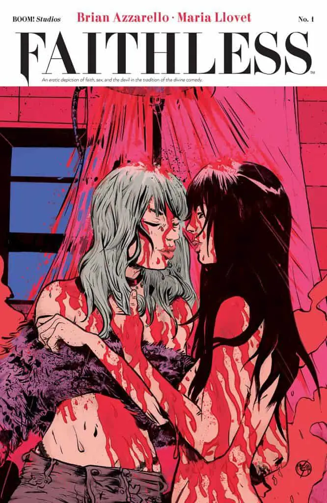
Main Cover: Paul Pope
Variant Cover: Tula Lotay
Unlocked Retailer Variant: Lee Bermejo
SRP: $3.99
Faith. Sex. The Devil.
Faith likes to dabble with magic. Her friends think it’s cute—and not just a little off-putting, but it’s part of her charm and her warped search for purpose in a world that makes too much sense. But she’s a true believer and knows there is a power within her reach. She’s right, of course. It just took a while for that magic, that temptation, that unknowable thing to find her . . .
In short—Faith is bored as hell. And Hell has noticed.
VARIANT COVERS
PopCultHQ’s Comic Book Review:
FAITHLESS #1
Faith hangs around, drinks coffee and dabbles in the occult. Nothing unusual at all, right? Her free-spirited world is about to be rocked when she meets the fantastic and enigmatic Poppy.
Writing:
It’s really a conflicting thing to read the works of a writer who is exploring new ideas. A writer who branches out to do something different to what brought them such renown. Finding Brian Azzarello through 100 bullets and thinking “this is the greatest crime writer of our time.” Then giving his take on Wonder Woman a wary chance and getting entrapped in the deep mythology and unique concepts. Moonshine mixed both to eventually become something to savor and really sink your teeth into.
But this? The jury’s still out I’m afraid.
The rapid-fire dialogue and fly on the wall perspective work well. But aside from the obvious moments that are meant to be key, nothing really happens. No, the exposition, set up, and the introduction of characters isn’t bad…they just aren’t up to Azzarello’s usual level of quality.
It’s fair enough to give the heavy investment in character a pass, but by the same token, it feels hookless. Not joyless by any means. There’s some fun. There are some good ideas. But there must be an indication that something will be worth the investment and this issue’s events tend to just float into view rather than hit, shock, or provoke much reaction.
Without being insulting, there’s a lot in this issue that feels under-written. Magic is a key theme of the story, but it’s just glossed over every time it’s mentioned. It’s not clear if that’s a function of the world the story exists in or if that’s going to make waves as the story progresses.
A first issue, a new idea, from somebody of Azzarello’s caliber feels like it should be more than this.
Art:
Maria Llovet’s art is the dominant feature of this book. It’s appropriate that the amazing work of Paul Pope decorates the cover to this issue because it is in the vein of Pope from which Llovet’s style stems.
Her background in fashion gives the design of characters supreme individuality and a cutting-edge feel.
Her distinct style remains consistent with the unmistakeably cool visuals of Loud and There’s Nothing There. The overarching themes of love, lust, sexual exploration, and the macabre are clearly something the Spanish-born artist pours her artistic soul into.
Her color work is a means for her art to exceed her Paul Pope influence. A hallmark, perhaps, of her fashion industry experience, it adds so much more to the character work and worldly setting of the book. It’s moody in parts and perfectly creates the atmosphere around a scene. Whether that be lackadaisical wading through Faith’s day, or the more lust-filled scenes.
She should be on every mainstream publishers’ radar and, judging by the strength of her storytelling abilities, those publishers should be throwing writer/artist opportunities at her with abandon.
Letters:
It’s not a book that calls for a Richard Starkings-like bombastic effort in terms of letter work. The highest regard that can be paid to AndWorld Design here is that the lettering suits the art and compliments it quietly. Minor effects such as the steam shower or a game of billiards don’t overshadow the panel, nor do they need to. Visually, the lettering has a quintessential indie feel to them and anything more would have had a disconnecting effect on the work
Not a typical first issue with a bang, nor the type of work fans of Azzarello would be used to. There are touches of his previous work, but this is Azzarello doing something completely different. Does it all work? Not yet… but it’s heading into some interesting directions.
3.5 out of 5 Stars

FAITHLESS #1 can be pre-ordered on ComiXology
and available at your local comic shop and
online retailers Wednesday, April 10th!


